Rebecca Tearle A2
Thursday, 3 April 2014
Tuesday, 1 April 2014
Monday, 31 March 2014
Feedback
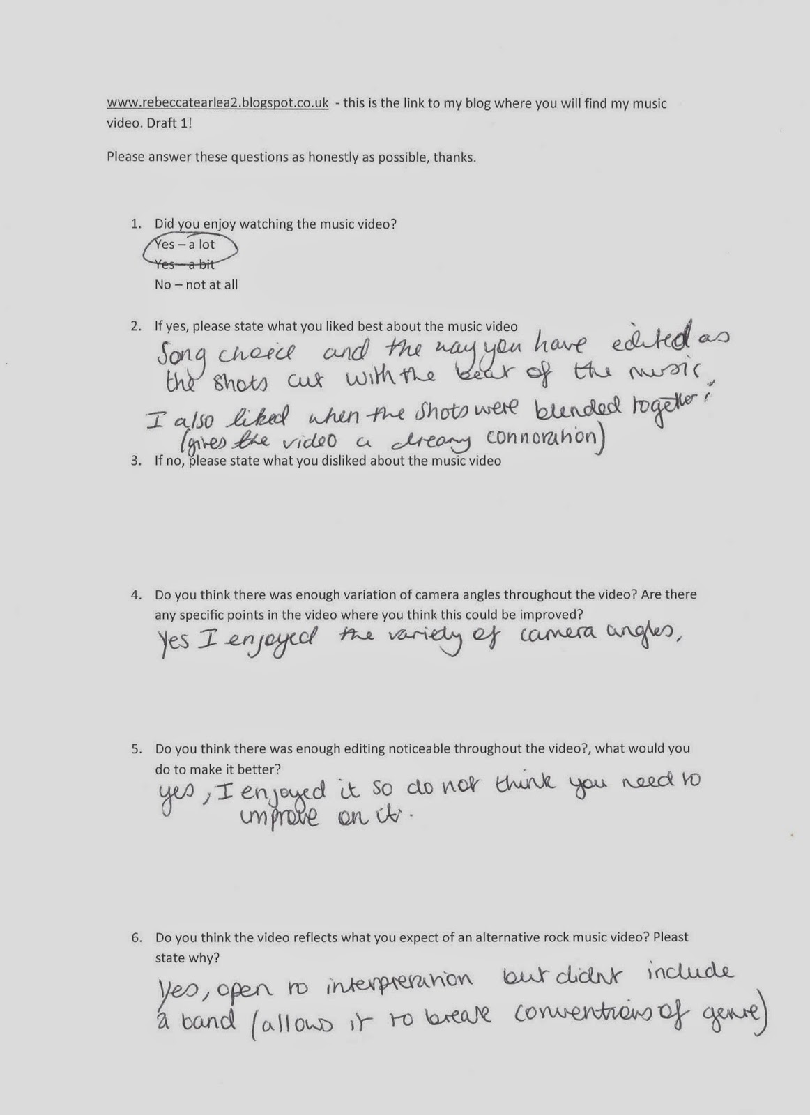
I gathered some feedback from this 2nd draft so that I know how I can improve the video for the final draft.
I did this by asking people to watch my video and then answer questionaires, emailing people for feedback and posting the video on facebook.
Audience feedback of the second draft by rebeccaktearle on GoAnimate
I did this by asking people to watch my video and then answer questionaires, emailing people for feedback and posting the video on facebook.
Audience feedback of the second draft by rebeccaktearle on GoAnimate
Music video draft 2
This is my second draft of the music video for this one I have added more effects to make it more abstratct such as 'ghosting' which cretaed a sense of surrealism. I also overlayed some shots to show contrast between business were i would film a busy scene such as a road with lots of traffic with a shot of her in an empty field that seemed a lot more peaceful, alons side this I change the speed so that she she was often slow and everything else was faster. To portray the idea of her being stuck in time whilst every one else is carrying on.
Friday, 28 March 2014
Magazine advertisment draft2
I havnt adapted this much from the first draft but I have tried to neaten and tidy it up in places where it looked messy, for example the clock hands were out of plcae and looked to messy so i have got rid of some and also re aligned them. i have changes the font in plcaes for example "available in store and on itunes 24th april 2014" to make it stand out more. i have made the font "character" bolder and edited it to get rid of some of the rough edges, i then experimented and played around witht some of the filters and i decided to add the 'texturiser' filter to the clock but then i also added it to the rest of the image and text to create continiuity throughout the poster.
i then added a saturation onto the images so make them seem like thiere coming out of the clock a bit more and to add some vibrancy to the images.
i then added a saturation onto the images so make them seem like thiere coming out of the clock a bit more and to add some vibrancy to the images.
Subscribe to:
Comments (Atom)


